

Recent Yieldbot Intent Streams Related to Steve Jobs
- Edit
- Delete
- Tags
- Autopost
At Yieldbot our focus is on collection, organization and realtime activation of visit intent in publisher content. We do this not as a network but on a publisher-by-publisher basis because of this simple fact; every publisher has a unique audience and unique content. What that means is that even if the keyword is the same across publishers, the intent associated with it varies in each domain.
The original purpose of this post however was not to point out the flaws of networked based keyword buying vs the performance advantage of Yieldbot’s publisher direct model. Nor was the purpose to show you how much we truly understand publisher side intent at the keyword level and how use that intelligence in an automated way to achieve the highest degrees of relevant matching.
The original purpose of the post was to meet the request of a few people that had asked me to share some more data visualization of our Intent Streams™ after we originally shared a few on our recent blog post about our data visualization methods.
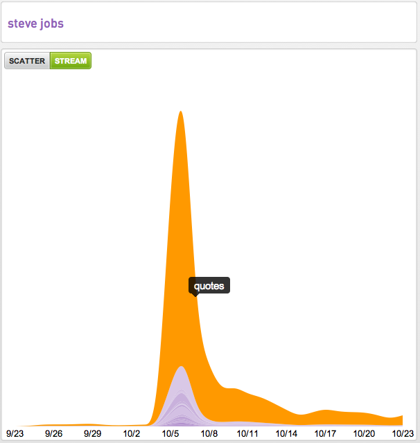
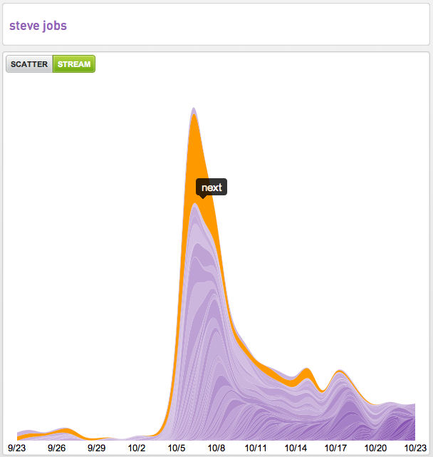
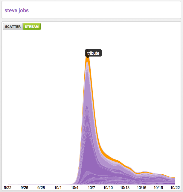
It occurred to me the other day that the best representative example over the last month was intent around “Steve Jobs” so below we are sharing our 30-day Intent Streams™ from four publishers.
If you’re new to our streamgraphs the width of the stream is the measure of pageviews of intent associated with the root intent “Steve Jobs.” The other useful data points in these visualizations are the emergence, increases, decreases and elimination of the associated intent over time. As well as how many terms are seen to be associated with the root intent.
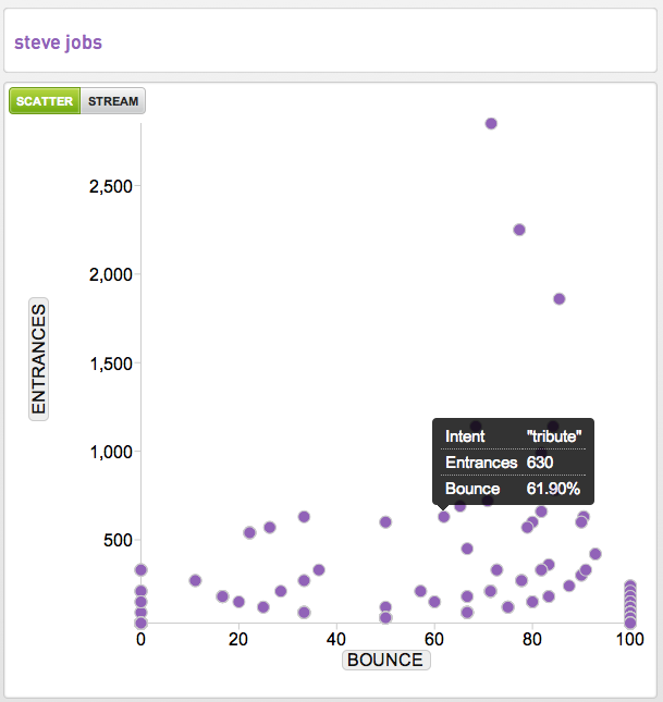
Another way we visualize intent data is across a scatter plot. Here you see the performance of the “Steve Jobs tribute” compared to the other intent related to Steve Jobs looking at the number of entrances (aka landings) on the y-axis and the bounce rate of that intent on the x-axis.
We hope you find this intent data as interesting as we do.